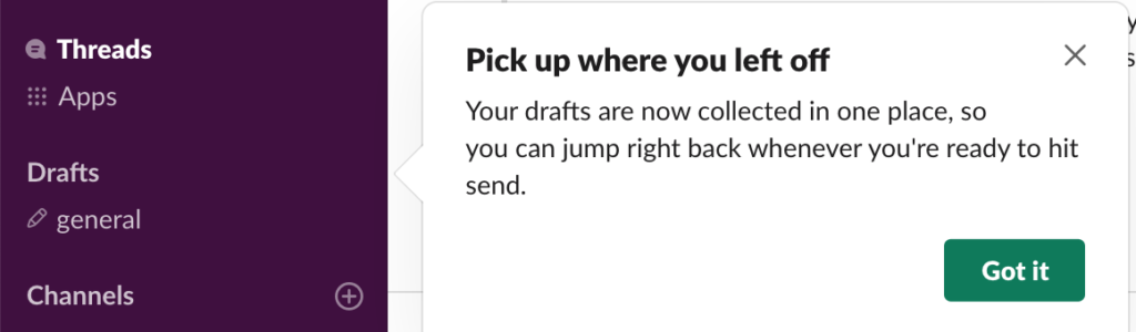
Seeing a popular post about a very hit or miss change to Slack’s product (the new WYSIWYG input box) made me think of another thing in Slack that has annoyingly changed (without an option to toggle off). Its “Drafts” feature – where leaving a channel with an unfinished message means that the channel itself gets moved to the top of the left sidebar.
It completely breaks my flow, because 1.) you can no longer use up/down hotkeys to reliably go between specific channels, and 2.) frequently have to do a double take and ask, “where did that channel go?” – especially if you Star specific DM channels, because those rest between the drafts section and the rest of the channels: meaning the Drafts are out of view most of the time. It’s a disorienting experience for new users and a pain to have to scroll up to click on the channel, when before I did not have to scroll up /and/ was able to use hotkeys to more quickly accomplish the same task.
I wish that Starring channels would somehow make them immune to jumping into Drafts, but alas, that doesn’t work.
Long ago I created a Chrome extension that reordered things nicely, but their CSS changes frequently which made it a maintenance hassle, and I read on HN another dev saying doing so is against their terms of service anyway.
Not a fan of that anti-tinkering attitude. Not just to developers but to ordinary users. Reordering channels in the sidebar is a basic example of tinkering, but it’s only for paid users.
Slack: don’t make dramatic changes to a user’s workflow without giving a simple toggle to preserve old behavior. Be more receptive to user feedback. Be open to fragmenting your UX for significant edge cases.
I get it, most users probably love the Drafts feature. My wife does, for example, and she works at a big organization, which has different needs from my workplace. But even if dramatic changes to product are approved of by 75% of users, every time you do so, you create whiplash for the other 25%, and prevent many from ever loving your product. With copycat services out there like Microsoft Teams, Slack’s leadership needs to order a copy of The Loyalty Effect and get back to the basics.
Take the WYSIWYG input box changes. I bet 75%+ of Slack’s users aren’t sharing code via the service frequently or code at all. But of the coders that do, probably 90% hate the change. If you apply a utilitarian “greatest good for the greatest number” approach, you are blinded to the alienation that is happening. Again, a simple toggle to preserve old behavior fixes a lot of this.